

Overview
TheCometChatConversations is a Widget, That shows all conversations related to the currently logged-in user,

Usage
Integration
AsCometChatConversations is a widget, it can be initiated either by tapping a button or through the trigger of any event. It offers multiple parameters and methods for tailoring its user interface.
You can launch CometChatConversations directly using Navigator.push, or you can define it as a widget within the build method of your State class.
1. Using Navigator to Launch CometChatConversations
- Dart
2. Embedding CometChatConversations as a Widget in the build Method
- Dart
Actions
Actions dictate how a widget functions. They are divided into two types: Predefined and User-defined. You can override either type, allowing you to tailor the behavior of the widget to fit your specific needs.onItemTap
onItemTap is triggered when you click on a ListItem of the CometChatConversations widget. This onItemTap method proves beneficial when a user intends to customize the click behavior in CometChatConversations.
- Dart
onItemLongPress
onItemLongPress is triggered when you on long press on a ListItem of the CometChatConversations widget. This onItemLongPress method proves beneficial when a user intends to customize the long press behavior in CometChatConversations.
- Dart
onBack
ThisonBack method becomes valuable when a user needs to override the action triggered upon pressing the back button in CometChatConversations.
- Dart
setOnSelection
TheonSelection feature enables selection with modes: SelectionMode.single and SelectionMode.multiple.
The onSelection event is triggered upon the completion of a selection in onSelection. This returns the selected conversations list when the callback is triggered. It can be executed with any button or action.
- Dart
onError
This method proves helpful when a user needs to customize the action taken upon encountering an error in CometChatConversations.- Dart
onLoad
Invoked when the list is successfully fetched and loaded, helping track component readiness.- Dart
onEmpty
Called when the list is empty, enabling custom handling such as showing a placeholder message- Dart
Filters
You can setConversationsRequestBuilder in the CometChatConversations widget to filter the conversation list. You can modify the builder as per your specific requirements with multiple options available to know more refer to ConversationsRequestBuilder.
You can set filters using the following parameters.
- Conversation Type: Filters on type of Conversation, User or Groups.
- Limit: Number of conversations fetched in a single request.
- WithTags: Filter on fetching conversations containing tags.
- Tags: Filters on specific Tag.
- UserTags: Filters on specific User Tag.
- GroupTags: Filters on specific Group Tag.
- Dart
Events
Events are emitted by aWidget. By using event you can extend existing functionality. Being global events, they can be applied in Multiple Locations and are capable of being Added or Removed.
1. Conversation Deleted
ThisccConversationDeleted will be emitted when the user deletes a conversation
- Dart
Customization
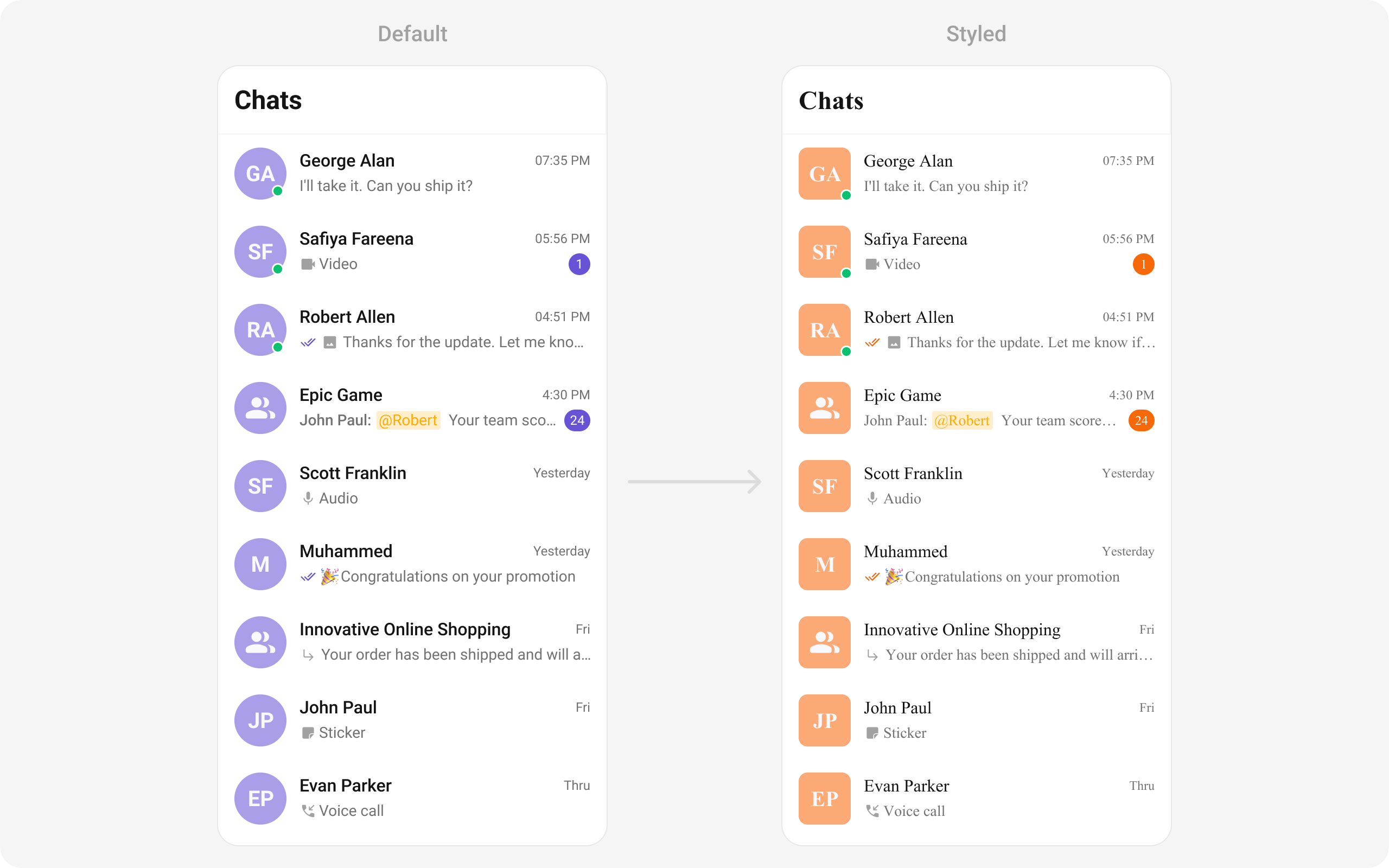
To align with your app’s design specifications, you have the flexibility to customize the appearance of the conversation widget. We offer accessible methods that empower you to tailor the experience and functionality to meet your unique requirements.Style
You can set theCometChatConversationsStyle to the CometChatConversations Widget to customize the styling.
- Dart
Functionality
These are a set of small functional customizations that allow you to fine-tune the overall experience of the widget. With these, you can change text, set custom icons, and toggle the visibility of UI elements.- Dart
CometChatConversations
Advanced
For advanced-level customization, you can set custom views to the widget. This lets you tailor each aspect of the widget to fit your exact needs and application aesthetics. You can create and define your own widget and then incorporate those into the widget.setOptions
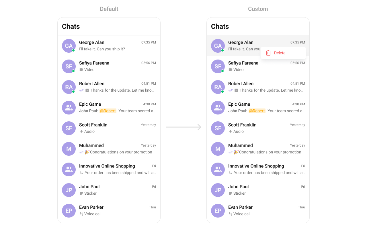
This method sets a predefined list of actions that users can perform when they long press a conversation in the list. These options typically include:- Deleting a conversation
- Marking a conversation as read or unread
- Pinning or unpinning a conversation
- Muting notifications for a specific conversation
- Dart
- Dart
addOptions
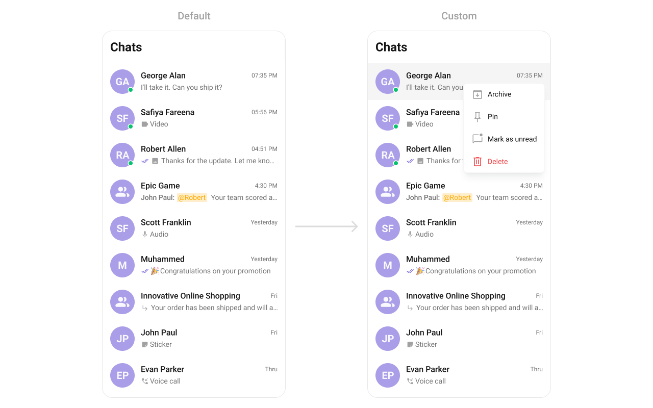
This method extends the existing set of actions available when users long press a conversation item. Unlike setOptionsDefines, which replaces the default options, addOptionsAdds allows developers to append additional actions without removing the default ones. Example use cases include:- Adding a “Report Spam” action
- Introducing a “Save to Notes” option
- Integrating third-party actions such as “Share to Cloud Storage”
- Dart
- Dart
disableSoundForMessages
This disables sound notifications for incoming messages. When activated, the application will not play an audio alert when new messages arrive. This feature is beneficial in scenarios where:- Users prefer a silent messaging experience
- The app is being used in a professional or quiet environment
- Background processes need to minimize distractions
- Dart
setCustomSoundForMessages
This method enables users to personalize their chat experience by setting a custom sound file for incoming message notifications. Users can choose from:- Default system sounds
- Custom sound files uploaded by the user
- Theme-based or brand-specific notification sounds
- Dart
loadingStateView
This method allows developers to set a custom loading view that is displayed when data is being fetched or loaded within the component. Instead of using a default loading spinner, a custom animation, progress bar, or branded loading screen can be displayed. Use cases :- Showing a skeleton loader for conversations while data loads
- Displaying a custom progress indicator with branding
- Providing an animated loading experience for a more engaging UI
- Dart
emptyStateView
Configures a custom view to be displayed when there are no conversations or messages in the list. This improves the user experience by providing meaningful content instead of an empty screen. Use cases :- Displaying a message like “No conversations yet. Start a new chat!”
- Showing an illustration or animation to make the UI visually appealing
- Providing a button to start a new conversation
- Dart
errorStateView
Defines a custom error state view that appears when an issue occurs while loading conversations or messages. This enhances the user experience by displaying friendly error messages instead of generic system errors. Use cases :- Showing “Something went wrong. Please try again.” with a retry button
- Displaying a connection issue message if the user is offline
- Providing troubleshooting steps for the error
- Dart
leadingView
Allows setting a custom leading view element that appears at the beginning of each conversation item. This is typically used to modify profile pictures, avatars, or icons in the conversation list. Use cases :- Displaying user avatars with online/offline status indicators
- Using initials or custom graphics instead of images
- Dart

- Dart
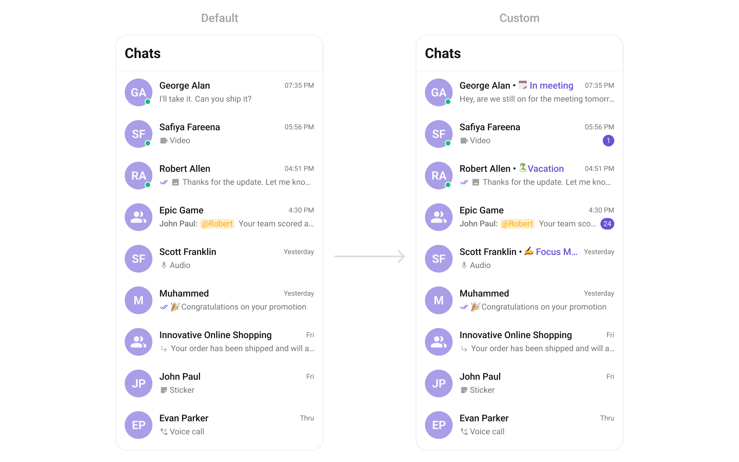
titleView
Overrides the default title view in the conversation list with a custom layout. This is useful for branding or modifying how conversation names and details are displayed. Use cases :- Displaying conversation titles with additional metadata (e.g., last seen time)
- Custom fonts or text styles for conversation names
- Adding icons or indicators next to titles
- Dart
- Dart
trailingView
Customizes the trailing (end) view of a conversation item, which is typically used for action buttons or additional information. Use cases :- Adding a mute/unmute button for each conversation
- Displaying the last message time in a custom format
- Showing unread message counts or notification badges
- Dart

- Dart
ListItemView
With this function, you can assign a custom ListItem view to theCometChatConversations Widget.
- Dart

- Dart
custom_list_item.dart
- Dart
main.dart
TextFormatters
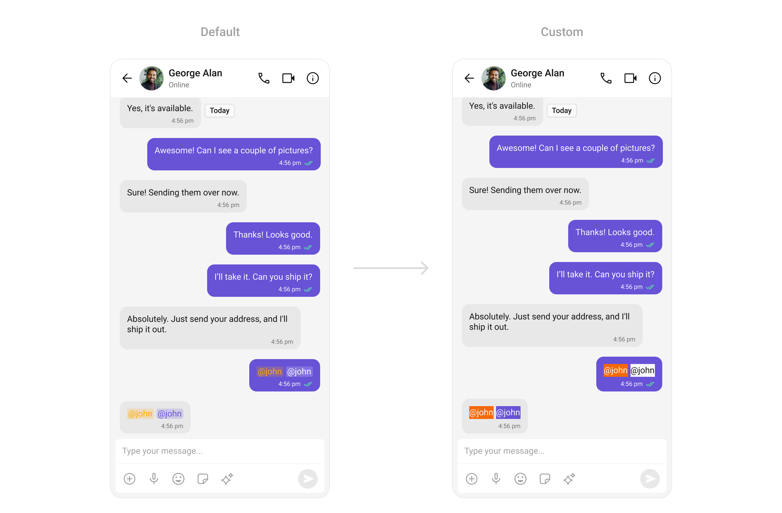
Assigns the list of text formatters. If the provided list is not null, it sets the list. Otherwise, it assigns the default text formatters retrieved from the data source. To configure the existing Mentions look and feel check out CometChatMentionsFormatter Example Here is the complete example for reference:- Dart
AppBarOptions
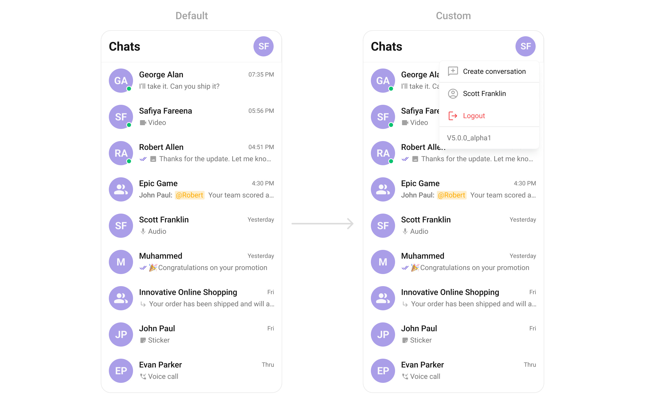
You can set the Custom AppBarOptions to theCometChatConversations widget.
- Dart
DatePattern
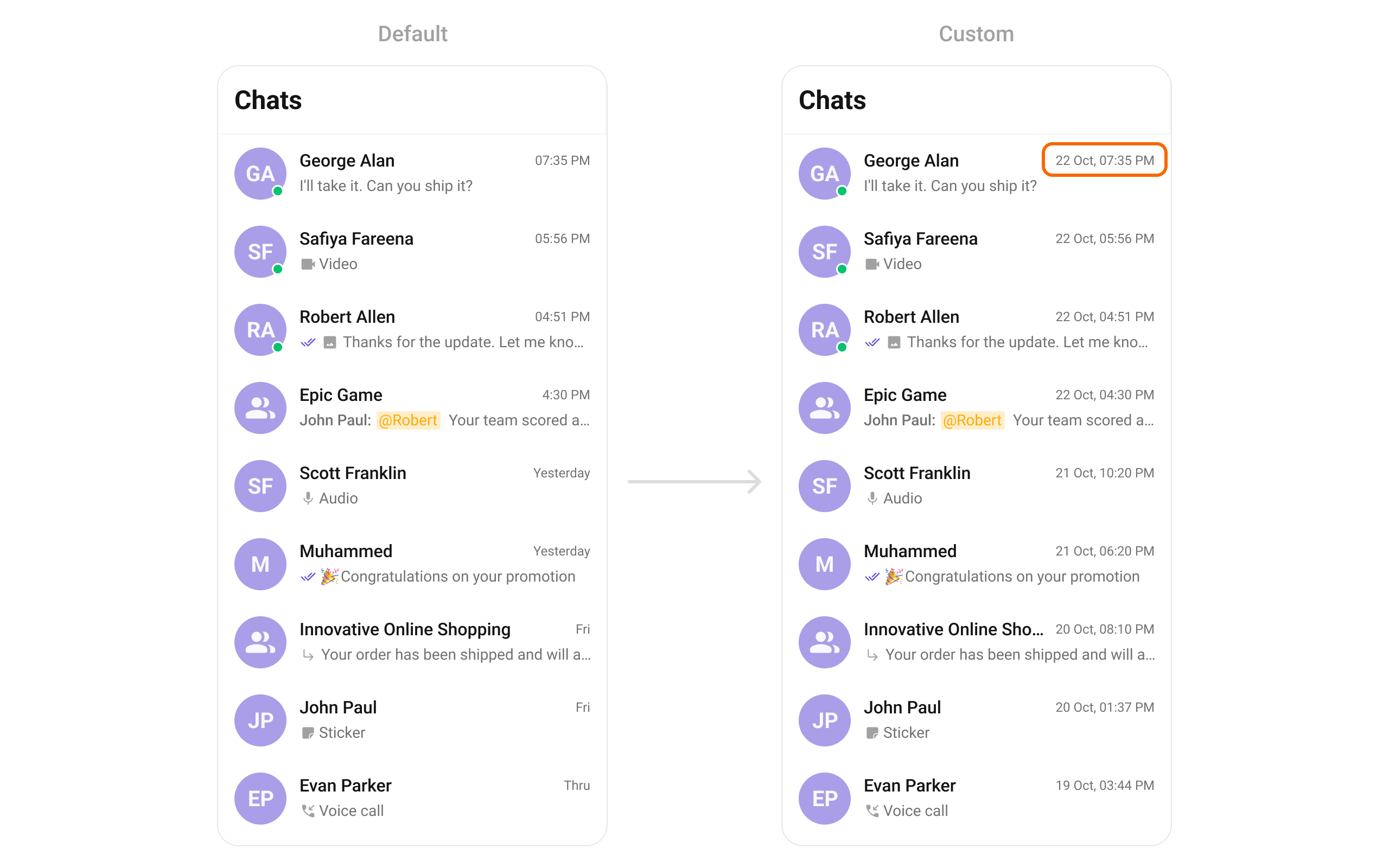
You can modify the date pattern to your requirement usingdatePattern. This method accepts a function with a return type String. Inside the function, you can create your own pattern and return it as a String.
- Dart
SubtitleView
You can customize the subtitle view for each conversation item to meet your requirements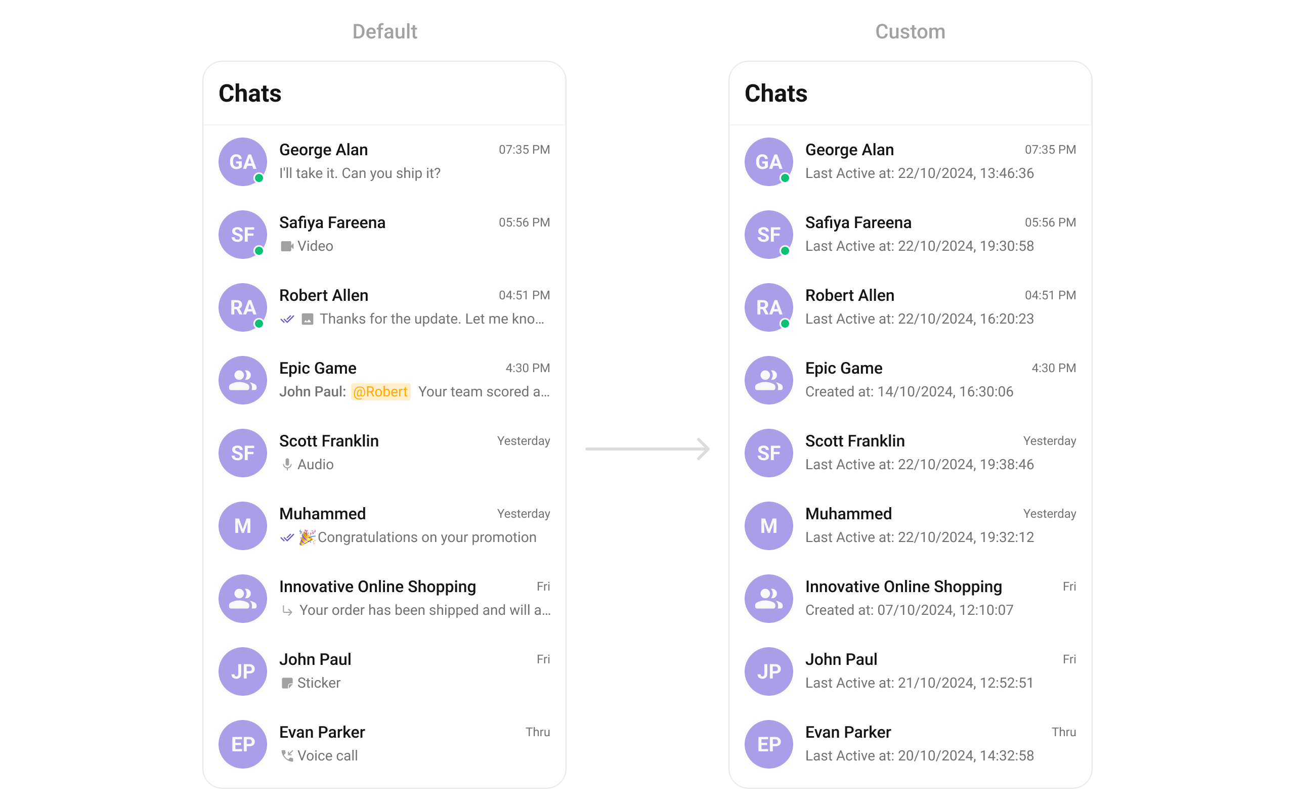
- Dart