Overview
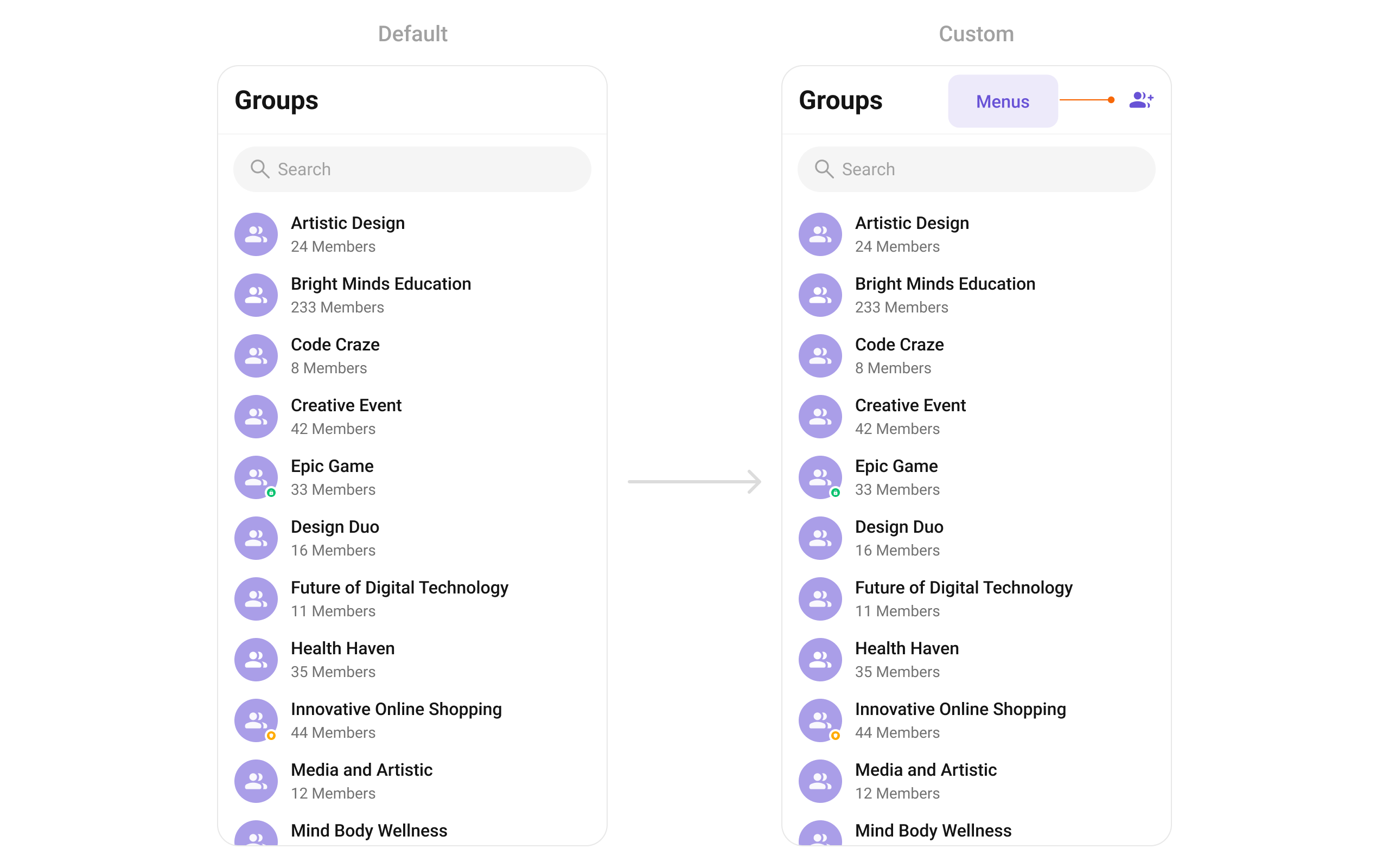
CometChatGroups functions as a standalone Widget designed to create a screen displaying a list of groups, with the added functionality of enabling users to search for specific groups. Acting as a container widget, CometChatGroups encapsulates and formats the CometChatListBase and CometChatGroupList widgets without introducing any additional behavior of its own.
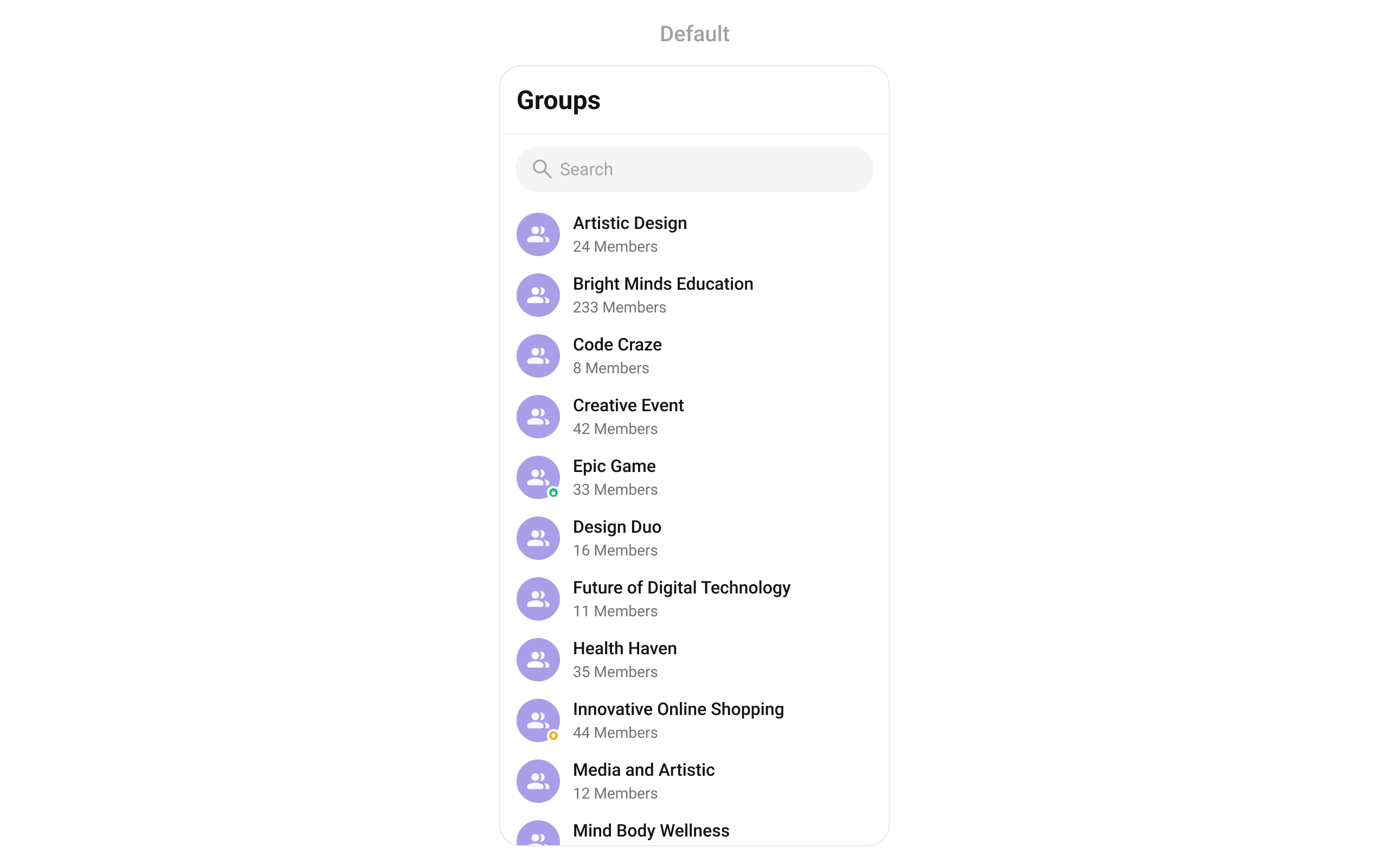
CometChatGroups widget is composed of the following BaseWidget:
Usage
Integration
AsCometChatGroups is a custom widget, it can be launched directly by user actions such as button clicks or other interactions.
You can launch CometChatGroups directly using Navigator.push, or you can define it as a widget within the build method of your State class.
1. Using Navigator to Launch CometChatGroups
- Dart
2. Embedding CometChatGroups as a Widget in the build Method
- Dart
Actions
Actions dictate how a widget functions. They are divided into two types: Predefined and User-defined. You can override either type, allowing you to tailor the behavior of the widget to fit your specific needs.1. onItemTap
This method proves valuable when users seek to override onItemTap functionality within CometChatGroups, empowering them with greater control and customization options. TheonItemTap action doesn’t have a predefined behavior. You can override this action using the following code snippet.
- Dart
2. onBack
Enhance your application’s functionality by leveraging theonBack feature. This capability allows you to customize the behavior associated with navigating back within your app. Utilize the provided code snippet to override default behaviors and tailor the user experience according to your specific requirements.
- Dart
3. onError
You can customize this behavior by using the provided code snippet to override theonError and improve error handling.
- Dart
4. onItemLongPress
This method becomes invaluable when users seek to override long-click functionality within CometChatGroups, offering them enhanced control and flexibility in their interactions. TheonItemLongPress action doesn’t have a predefined behavior. You can override this action using the following code snippet.
- Dart
5. onSelection
When theonSelection event is triggered, it furnishes the list of selected groups. This event can be invoked by any button or action within the interface. You have the flexibility to implement custom actions or behaviors based on the selected groups.
This action does not come with any predefined behavior. However, you have the flexibility to override this event and tailor it to suit your needs using the following code snippet.
- Dart
onLoad
Invoked when the list is successfully fetched and loaded, helping track component readiness.- Dart
onEmpty
Called when the list is empty, enabling custom handling such as showing a placeholder message.- Dart
Filters
Filters allow you to customize the data displayed in a list within a Component. You can filter the list based on your specific criteria, allowing for a more customized. Filters can be applied using RequestBuilders of Chat SDK.1. GroupsRequestBuilder
The GroupsRequestBuilder enables you to filter and customize the group list based on available parameters in GroupsRequestBuilder. This feature allows you to create more specific and targeted queries when fetching groups. The following are the parameters available in GroupsRequestBuilder- Dart
Events
Events are emitted by aCometChatGroups Widget. By using event you can extend existing functionality. Being global events, they can be applied in Multiple Locations and are capable of being Added or Removed.
The list of events emitted by the CometChatGroups widget is as follows.
- Dart
your_screen.dart
Customization
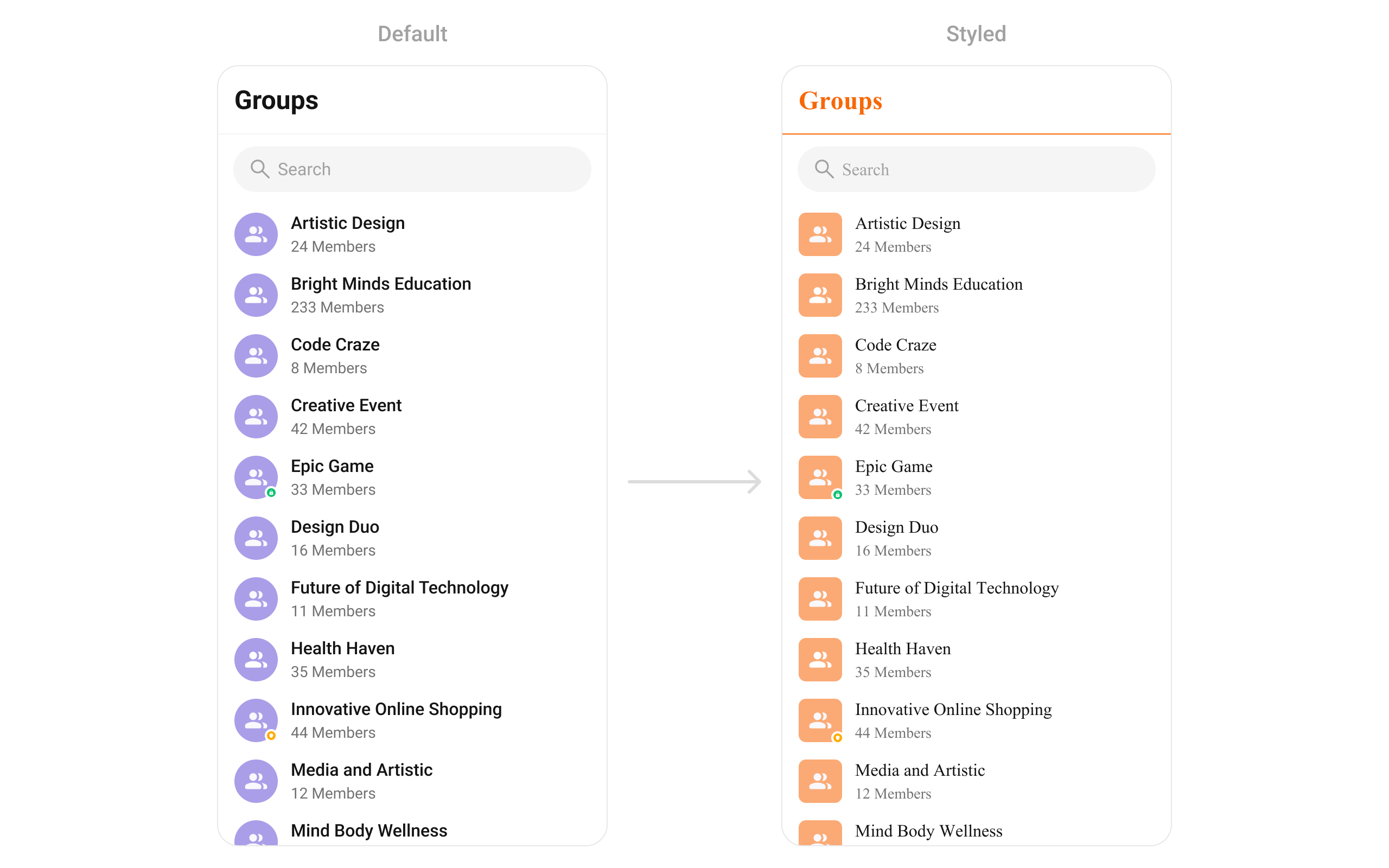
To fit your app’s design requirements, you can customize the appearance of the groups widget. We provide exposed methods that allow you to modify the experience and behavior according to your specific needs.Style
Enhance yourCometChatGroups Widget by setting the CometChatGroupsStyle to customize its appearance.
- Dart
Functionality
These are a set of small functional customizations that allow you to fine-tune the overall experience of the widget. With these, you can change text, set custom icons, and toggle the visibility of UI elements.- Dart
List of properties exposed by CometChatGroups
Advance
For advanced-level customization, you can set custom views to the widget. This lets you tailor each aspect of the widget to fit your exact needs and application aesthetics. You can create and define your own widget and then incorporate those into the widget.setOptions
This method sets a predefined list of actions that users can perform when they long press a user in the list. These options typically include:- Enable actions like “Mute Notifications”, “Leave Group”, “Pin Group”.
- Provide admin-only actions like “Manage Members”, “Delete Group”.
- Dart
addOptions
This method extends the existing set of actions available when users long press a group item. Unlike setOptionsDefines, which replaces the default options, addOptionsAdds allows developers to append additional actions without removing the default ones. Example use cases include:- Adding a “Report Spam” action
- Introducing a “Save to Notes” option
- Integrating third-party actions such as “Share to Cloud Storage”
- Dart
loadingStateView
Configures a custom loading view displayed while groups are being fetched.- Show a spinner with “Loading groups…” text.
- Display a skeleton loader for a smooth UI experience.
- Dart
emptyStateView
Defines a view that appears when no groups are available.- Show a message like “No groups found, create one now!”.
- Display an illustration with a “Create New Group” button.
- Dart
errorStateView
Configures the UI when an error occurs while fetching groups.- Display a retry button with “Failed to load groups, try again.”.
- Show a friendly error illustration.
- Dart
leadingView
Sets a custom leading view that appears at the start of each group item.- Display the group profile picture.
- Add an icon indicating Public or Private groups.
- Dart
titleView
Customizes the title view of each group item, which typically displays the group name.- Style group names with custom fonts and colors.
- Show a verified badge for official groups.
- Dart
trailingView
Allows custom elements to be added at the end of each group item, such as buttons or indicators.- Show unread message counts.
- Add a quick Join or Leave button.
- Dart
ListItemView
With this function, you can assign a custom ListItem to theCometChatGroups Widget.
- Dart
- Dart
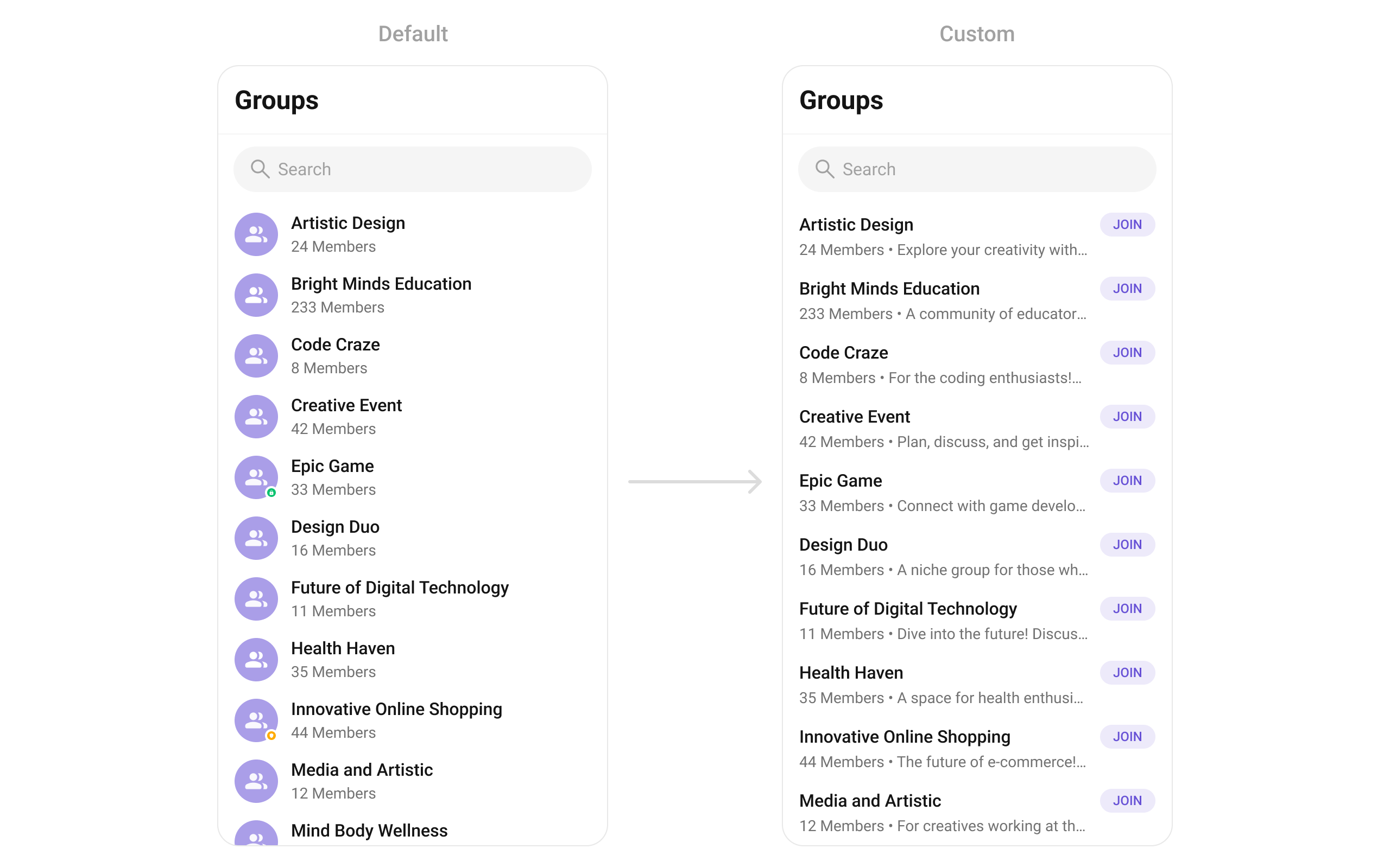
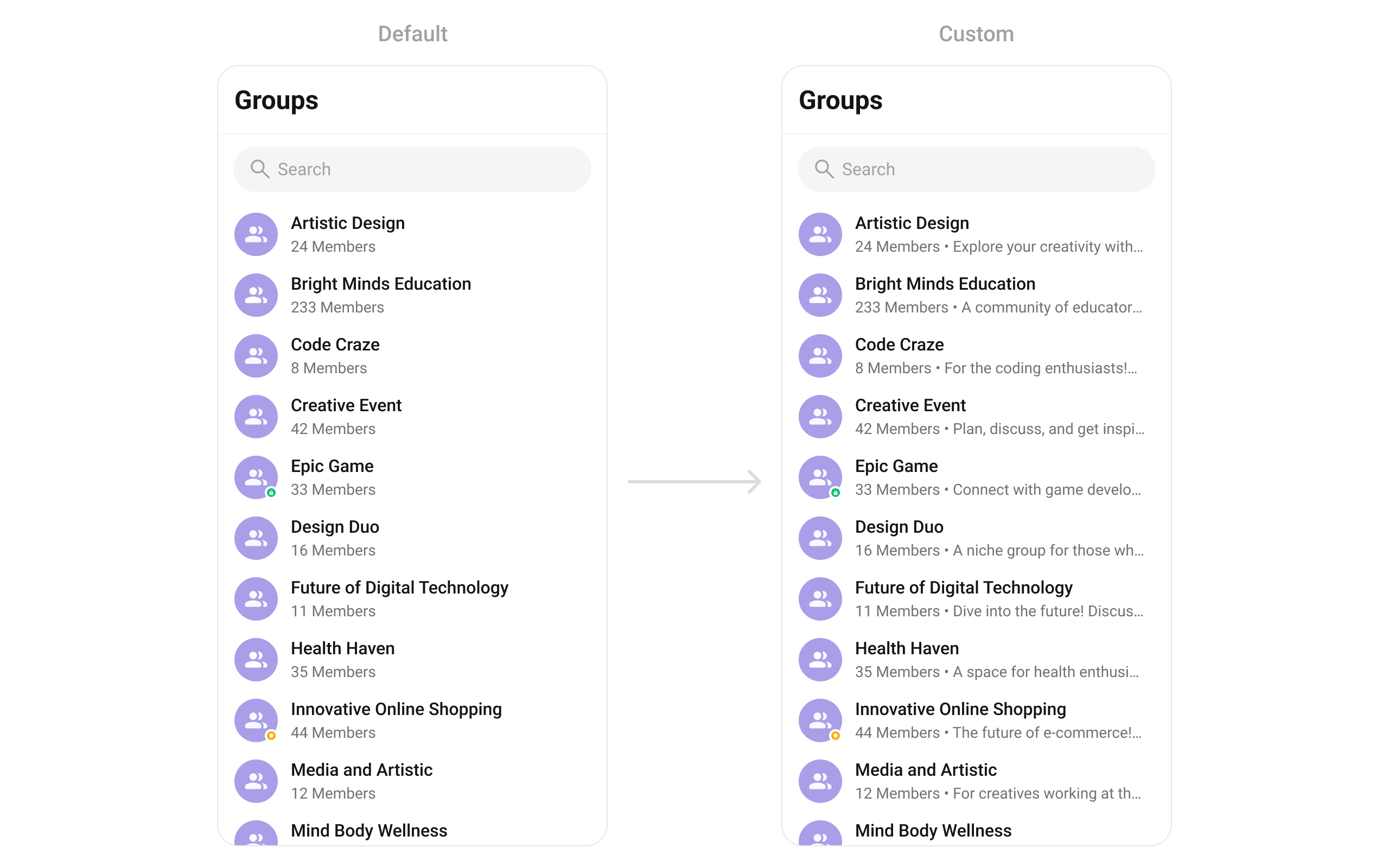
SubtitleView
You can customize the subtitle view for each item to meet your specific preferences and needs.- Dart
AppBarOptions
You can set the CustomappBarOptions to the CometChatGroups widget.
- Dart