

Overview
The Users is a Component, showcasing an accessible list of all available users. It provides an integral search functionality, allowing you to locate any specific user swiftly and easily. For each user listed, the widget displays the user’s name by default, in conjunction with their avatar when available. Furthermore, it includes a status indicator, visually informing you whether a user is currently online or offline.
Usage
Integration
To use Users in your component, use the following code snippet:App.tsx
Actions
Actions dictate how a component functions. They are divided into two types: Predefined and User-defined. You can override either type, allowing you to tailor the behavior of the component to fit your specific needs.onItemPress
Function invoked when a user item is clicked, typically used to open a user profile or chat screen.- App.tsx
onItemLongPress
Function executed when a user item is long-pressed, allowing additional actions like delete or block.- App.tsx
onBack
onBack is triggered when you press the back button in the app bar. It has a predefined behavior; when clicked, it navigates to the previous activity. However, you can override this action using the following code snippet.
- App.tsx
onSelection
Called when a item from the fetched list is selected, useful for multi-selection features.- App.tsx
onError
This action doesn’t change the behavior of the component but rather listens for any errors that occur in the Users component.- App.tsx
onEmpty
Called when the list is empty, enabling custom handling such as showing a placeholder message.- App.tsx
onLoad
Invoked when the list is successfully fetched and loaded, helping track component readiness.- App.tsx
onSubmit
Callback when submit selection button is pressed.- App.tsx
Filters
Filters allow you to customize the data displayed in a list within a Component. You can filter the list based on your specific criteria, allowing for a more customized. Filters can be applied using RequestBuilders of Chat SDK.1. UserRequestBuilder
The UserRequestBuilder enables you to filter and customize the user list based on available parameters in UserRequestBuilder. This feature allows you to create more specific and targeted queries when fetching users. The following are the parameters available in UserRequestBuilder
Example
In the example below, we are applying a filter to the UserList based on Friends.
- App.tsx
2. SearchRequestBuilder
The SearchRequestBuilder uses UserRequestBuilder enables you to filter and customize the search list based on available parameters in UserRequestBuilder. This feature allows you to keep uniformity between the displayed UserList and searched UserList. Example- App.tsx
Events
Events are emitted by aComponent. By using event you can extend existing functionality. Being global events, they can be applied in Multiple Locations and are capable of being Added or Removed.
To handle events supported by Users you have to add corresponding listeners by using CometChatUIEventHandler.addUserListener
- Adding Listeners
Customization
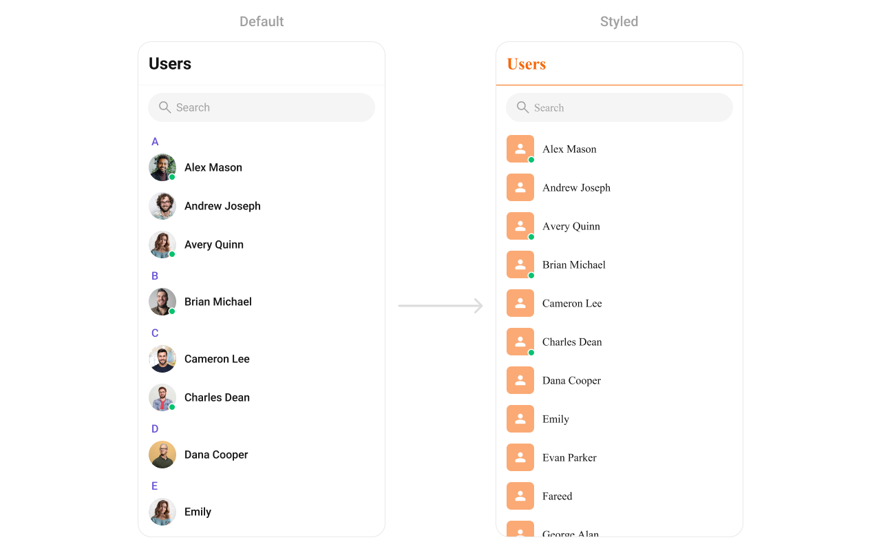
To fit your app’s design requirements, you can customize the appearance of the User component. We provide exposed methods that allow you to modify the experience and behavior according to your specific needs.Style
Using Style you can customize the look and feel of the component in your app, These parameters typically control elements such as the color, size, shape, and fonts used within the component. You can set the styling object to theCometChatUsers Component to customize the styling.
- App.tsx
Functionality
These are a set of small functional customizations that allow you to fine-tune the overall experience of the component. With these, you can toggle the visibility of UI elements. Below is a list of customizations along with corresponding code snippetsAdvanced
For advanced-level customization, you can set custom views to the component. This lets you tailor each aspect of the component to fit your exact needs and application aesthetics. You can create and define your views, layouts, and UI elements and then incorporate those into the component.LoadingView
This method allows developers to set a custom loading view that is displayed when data is being fetched or loaded within the component. Instead of using a default loading spinner, a custom animation, progress bar, or branded loading screen can be displayed. Use cases:- Showing a skeleton loader for users while data loads
- Displaying a custom progress indicator with branding
- Providing an animated loading experience for a more engaging UI
- App.tsx
EmptyView
Configures a custom view to be displayed when there are no users. This improves the user experience by providing meaningful content instead of an empty screen. Examples:- Displaying a message like “No users yet. Start a new chat!”
- Showing an illustration or animation to make the UI visually appealing
- Providing a button to start a new user
- App.tsx
ErrorView
Defines a custom error state view that appears when an issue occurs while loading users or messages. This enhances the user experience by displaying friendly error messages instead of generic system errors. Common use cases:- Showing “Something went wrong. Please try again.” with a retry button
- Displaying a connection issue message if the user is offline
- Providing troubleshooting steps for the error
- App.tsx
LeadingView
This method allows developers to set a custom leading view element that appears at the beginning of each user item. Typically, this space is used for profile pictures, avatars, or user badges. Use Cases:- Profile Pictures & Avatars – Display user profile images with online/offline indicators.
- Custom Icons or Badges – Show role-based badges (Admin, VIP, Verified) before the user name.
- Status Indicators – Add an active status ring or colored border based on availability.
- App.tsx
TitleView
This method customizes the title view of each user item, which typically displays the user’s name. It allows for styling modifications, additional metadata, or inline action buttons. Use Cases:- Styled Usernames – Customize fonts, colors, or text sizes for the name display.
- Additional Metadata – Show extra details like username handles or job roles.
- Inline Actions – Add a follow button or verification checkmark next to the name.
- App.tsx
TrailingView
This method allows developers to customize the trailing (right-end) section of each user item, typically used for actions like buttons, icons, or extra information. Use Cases:- Quick Actions – Add a follow/unfollow button.
- Notification Indicators – Show unread message counts or alert icons.
- Custom Info Display – Display last active time or mutual connections.
- App.tsx
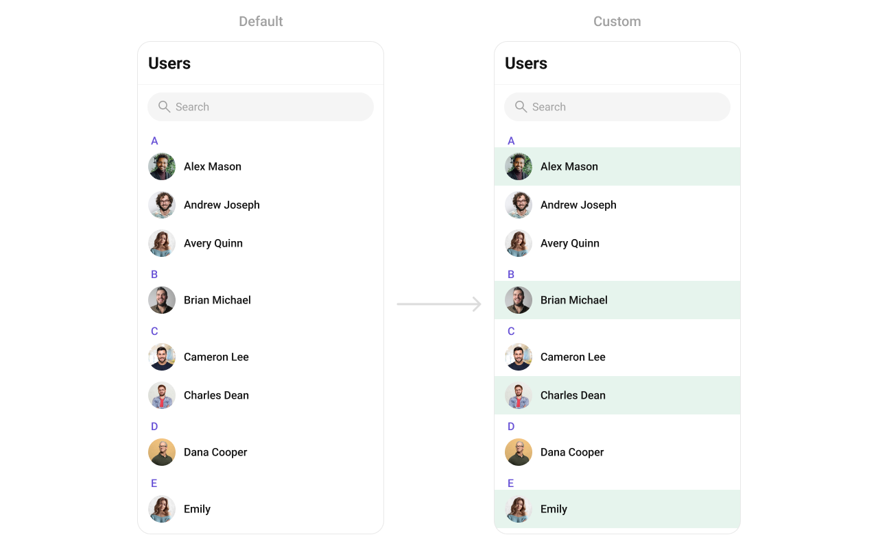
ItemView
This method allows developers to assign a fully custom ListItem layout to the Users component, replacing the default design. It provides complete control over the appearance and structure of each user item in the list. Use Cases:- Customizing User Display – Modify how user information (name, avatar, status) is presented.
- Adding Action Buttons – Include follow, message, or call buttons directly in the item view.
- Highlighting User Roles – Display user badges such as Admin, Moderator, or VIP.
- App.tsx
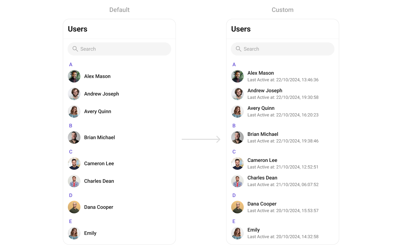
SubtitleView
This method customizes the subtitle view of each user item, typically shown below the user’s name. It can display additional details such as user status, last seen time, or a brief bio. Use Cases:- Last Active Time – Show “Online Now”, “Last seen 2 hours ago”.
- User Status – Display status messages like “Offine”, “Available”.
- App.tsx
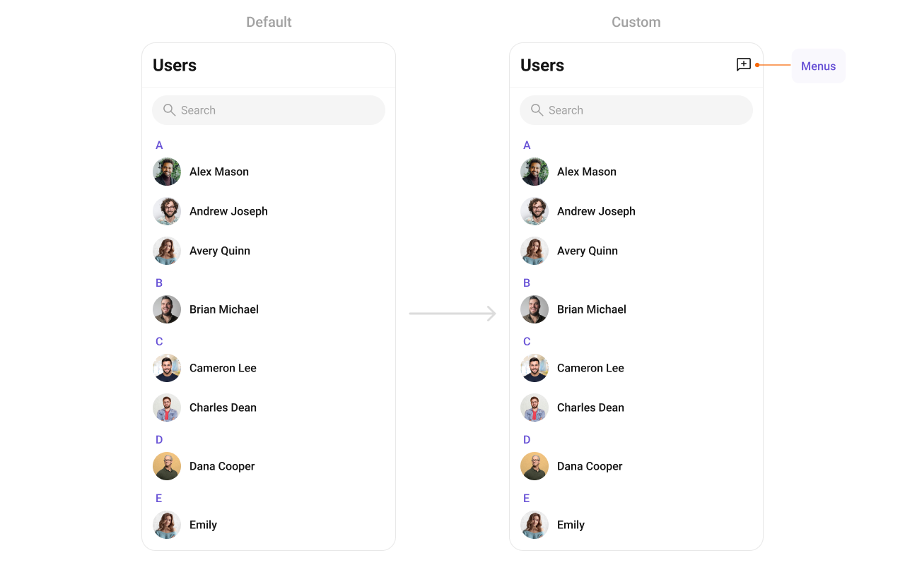
AppBarOptions
This method customizes the overflow menu, typically appearing as a three-dot (⋮) icon, allowing additional options for each user in the list. Use Cases:- User Management Actions – “Block User”, “Report”, “Add to Favorites”.
- Friendship & Communication – “Send Message”, “Follow/Unfollow”.
- Profile Settings – “View Profile”, “Edit Contact Info”.
- App.tsx
options
This method sets a predefined list of actions that users can perform when they long press a user in the list. These options typically include:- Muting notifications for a specific user.
- App.tsx
addOptions
This method extends the existing set of actions available when users long press a user item. Unlike setOptions, which replaces the default options, addOptionsAdds allows developers to append additional actions without removing the default ones. Example use cases include: Use Cases:- Adding a “Report Spam” action.
- Introducing a “Save to Notes” option.
- Integrating third-party actions such as “Share to Cloud Storage”.
- App.tsx